
Introduction:
Color has the remarkable ability to transform a space, evoke emotions, and reflect personal style. Vibrant art prints offer an exciting opportunity to infuse personality, energy, and a pop of color into any interior. By understanding color theory basics and current trends, you can strategically incorporate colorful art prints to create a dynamic and visually captivating environment. In this blog, we will guide you through using vibrant art prints to add personality and vibrancy to your space, allowing you to create a bold statement that reflects your unique style.
1. Color Theory Basics:
Before diving into the world of vibrant art prints, it's helpful to understand some basic principles of color theory:
- Hue: Refers to the pure color itself, such as red, blue, or yellow.
- Saturation: Represents the intensity or purity of a color. Highly saturated colors are vivid and bold, while desaturated colors are more subdued.
- Value: Refers to the lightness or darkness of a color. Lighter values are often associated with brightness and a sense of airiness, while darker values create depth and richness.
- Complementary Colors: Colors that are opposite each other on the color wheel, such as red and green or blue and orange. Complementary colors create a strong contrast when placed together, adding visual interest and vibrancy to a space.
2. Adding Personality with Colorful Art Prints:
a. Selecting a Color Palette: Determine the color palette that resonates with your desired atmosphere and personal style. Consider your existing decor and furnishings, as well as the mood you want to evoke. You can opt for a complementary color scheme to create a bold contrast or choose analogous colors (colors next to each other on the color wheel) for a harmonious and cohesive look.
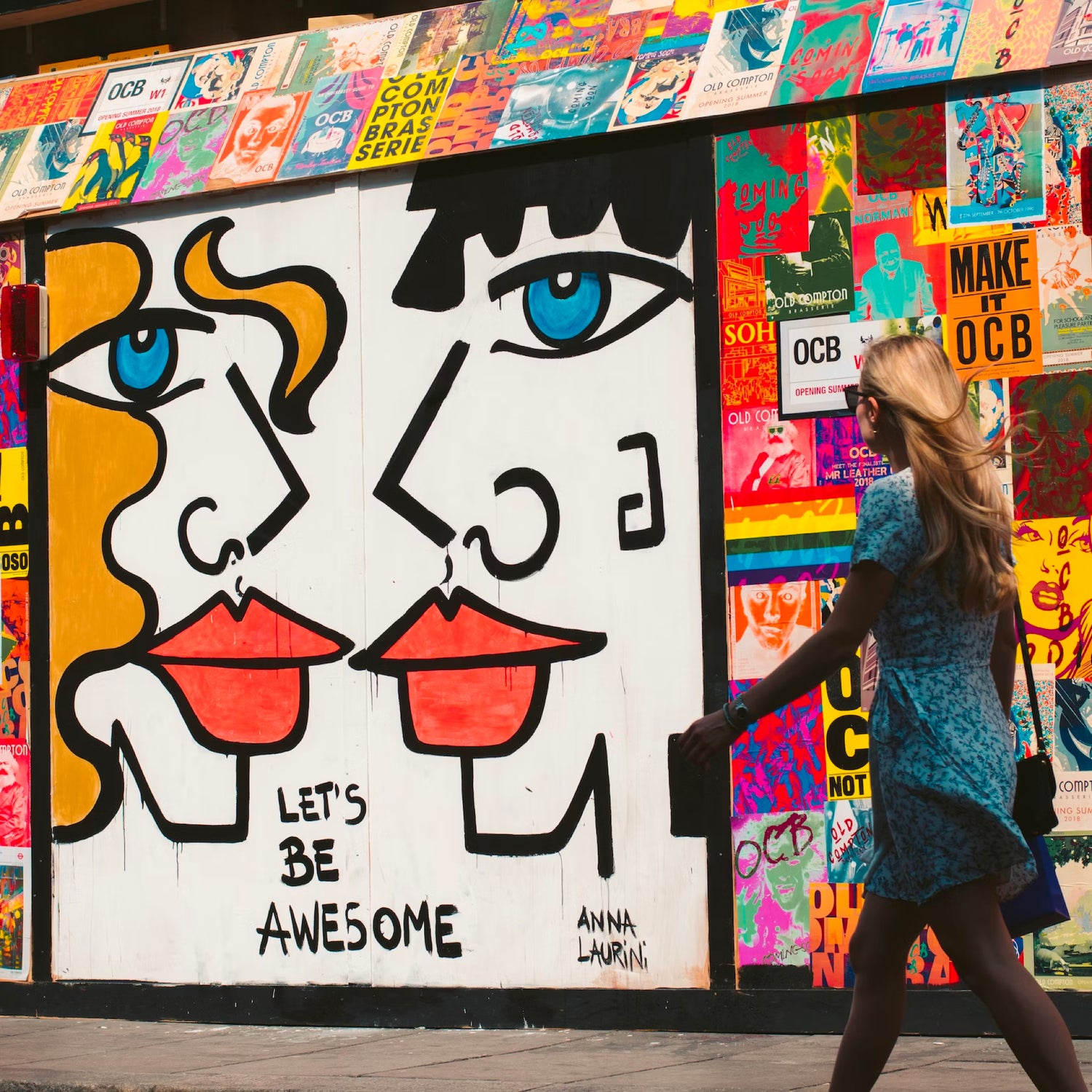
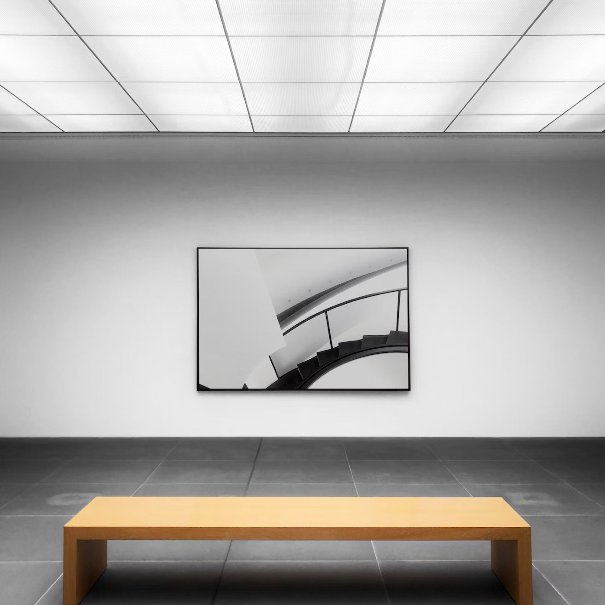
b. Focal Point: Choose a vibrant art print as a focal point in your space. Look for prints that feature bold, vibrant colors that align with your color palette. This print will become the centerpiece, drawing attention and setting the tone for the entire room.
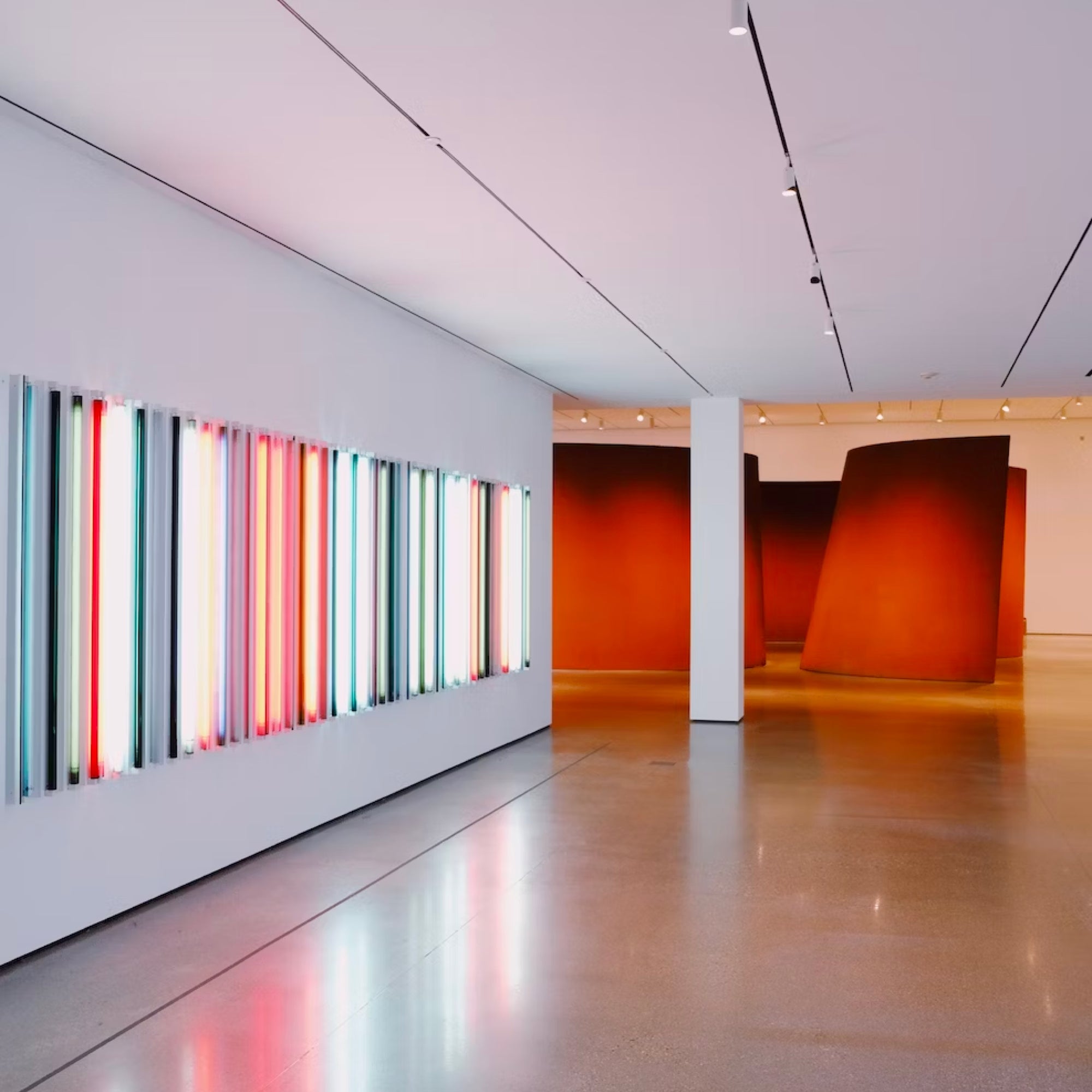
c. Accent Pieces: Use colorful art prints as accent pieces to add pops of color throughout the space. Consider smaller prints or a collection of prints that feature complementary or contrasting colors. Place them strategically in areas that need a visual lift, such as above a fireplace, on a prominent wall, or in a hallway.
d. Balance and Proportion: Ensure a harmonious composition by balancing the use of vibrant art prints with other elements in the space. Consider the proportions and distribution of colors throughout the room to achieve a visually pleasing balance. Too many vibrant prints in one area may overwhelm, while a lack of color accents can make the space feel dull.
3. Current Color Trends:
Stay informed about current color trends to infuse your space with a fresh and contemporary vibe. Here are a few popular color trends:
a. Nature-inspired Colors: Earthy tones like terracotta, deep greens, and rusty oranges are trending, bringing warmth and grounding to a space. Use art prints that feature these colors to create a connection with nature.
b. Jewel Tones: Rich, saturated jewel tones like emerald green, sapphire blue, and amethyst purple are making a comeback. These colors add drama and luxury to a room. Choose art prints that showcase these hues to create a sense of opulence.
c. Pastel Hues: Soft pastel colors, such as blush pink, mint green, and baby blue, continue to be popular for creating a light and airy ambiance. Art prints with delicate, soothing tones can bring a sense of tranquility to your space.
4. Harmonizing with Existing Decor:
When incorporating vibrant art prints, consider how they will harmonize with your existing decor. If your space already features bold or busy patterns, opt for art prints with more subdued colors to prevent overwhelming visual clutter. Conversely, if your decor is more neutral or minimalist, use vibrant art prints to add a pop of color and create a focal point.
Conclusion:
By understanding the principles of color theory and current color trends, you can confidently integrate vibrant art prints into your space, adding personality, energy, and visual impact. Whether you opt for complementary contrasts or harmonious analogies, colorful art prints will inject life, vibrancy, and a pop of personality into your interior. Explore the diverse collection of vibrant art prints at Wall vs. Me, where you'll discover an array of captivating artworks from independent artists worldwide. Let your space come alive with the bold and captivating charm of vibrant art prints.
Color has the remarkable ability to transform a space, evoke emotions, and reflect personal style. Vibrant art prints offer an exciting opportunity to infuse personality, energy, and a pop of color into any interior. By understanding color theory basics and current trends, you can strategically incorporate colorful art prints to create a dynamic and visually captivating environment. In this blog, we will guide you through using vibrant art prints to add personality and vibrancy to your space, allowing you to create a bold statement that reflects your unique style.
1. Color Theory Basics:
Before diving into the world of vibrant art prints, it's helpful to understand some basic principles of color theory:
- Hue: Refers to the pure color itself, such as red, blue, or yellow.
- Saturation: Represents the intensity or purity of a color. Highly saturated colors are vivid and bold, while desaturated colors are more subdued.
- Value: Refers to the lightness or darkness of a color. Lighter values are often associated with brightness and a sense of airiness, while darker values create depth and richness.
- Complementary Colors: Colors that are opposite each other on the color wheel, such as red and green or blue and orange. Complementary colors create a strong contrast when placed together, adding visual interest and vibrancy to a space.
2. Adding Personality with Colorful Art Prints:
a. Selecting a Color Palette: Determine the color palette that resonates with your desired atmosphere and personal style. Consider your existing decor and furnishings, as well as the mood you want to evoke. You can opt for a complementary color scheme to create a bold contrast or choose analogous colors (colors next to each other on the color wheel) for a harmonious and cohesive look.
b. Focal Point: Choose a vibrant art print as a focal point in your space. Look for prints that feature bold, vibrant colors that align with your color palette. This print will become the centerpiece, drawing attention and setting the tone for the entire room.
c. Accent Pieces: Use colorful art prints as accent pieces to add pops of color throughout the space. Consider smaller prints or a collection of prints that feature complementary or contrasting colors. Place them strategically in areas that need a visual lift, such as above a fireplace, on a prominent wall, or in a hallway.
d. Balance and Proportion: Ensure a harmonious composition by balancing the use of vibrant art prints with other elements in the space. Consider the proportions and distribution of colors throughout the room to achieve a visually pleasing balance. Too many vibrant prints in one area may overwhelm, while a lack of color accents can make the space feel dull.
3. Current Color Trends:
Stay informed about current color trends to infuse your space with a fresh and contemporary vibe. Here are a few popular color trends:
a. Nature-inspired Colors: Earthy tones like terracotta, deep greens, and rusty oranges are trending, bringing warmth and grounding to a space. Use art prints that feature these colors to create a connection with nature.
b. Jewel Tones: Rich, saturated jewel tones like emerald green, sapphire blue, and amethyst purple are making a comeback. These colors add drama and luxury to a room. Choose art prints that showcase these hues to create a sense of opulence.
c. Pastel Hues: Soft pastel colors, such as blush pink, mint green, and baby blue, continue to be popular for creating a light and airy ambiance. Art prints with delicate, soothing tones can bring a sense of tranquility to your space.
4. Harmonizing with Existing Decor:
When incorporating vibrant art prints, consider how they will harmonize with your existing decor. If your space already features bold or busy patterns, opt for art prints with more subdued colors to prevent overwhelming visual clutter. Conversely, if your decor is more neutral or minimalist, use vibrant art prints to add a pop of color and create a focal point.
Conclusion:
By understanding the principles of color theory and current color trends, you can confidently integrate vibrant art prints into your space, adding personality, energy, and visual impact. Whether you opt for complementary contrasts or harmonious analogies, colorful art prints will inject life, vibrancy, and a pop of personality into your interior. Explore the diverse collection of vibrant art prints at Wall vs. Me, where you'll discover an array of captivating artworks from independent artists worldwide. Let your space come alive with the bold and captivating charm of vibrant art prints.
Leave a comment
All comments are moderated before being published.
This site is protected by reCAPTCHA and the Google Privacy Policy and Terms of Service apply.